Danke an Corona Blog dass wir den Text verwenden dürfen 🙂 . Besser hätten wir es auch nicht schreiben können! Danke an Martin Adam für die Karten
Wir alle kennen die Horrorbilder und Schreckensszenarien der Corona-Pandemie, die uns tagtäglich in den Quantitätsmedien präsentiert werden. Aktuell wird gerade Indien dafür herangezogen. Mit – mehr oder weniger aktuellen – Bildern wird hierzulande versucht ein dramatisches Bild von der Situation dort zu verbreiten.
Martin Adam hat sich die Situation genauer angesehen und unzählige Daten ausgewertet und zusammengefasst, die ein ganz anderes Bild der Pandemie zeichnen. Nachfolgend findet ihr das „alternative Dashboard“, welches die Situation objektiv und ausführlich darstellt.
Eine objektivere Darstellung
Deutschlands Inzidenzzahlen
Die erste Karte ist auf Grundlage der Daten des RKI und der Gesundheitsämter aufgebaut – wir kennen Sie wohl alle aus der Tagesschau.
Natürlich trifft all die Kritik, die es an diesen Zahlen gibt, auch bei der neuen Karte von Martin Adam zu:
Die Zahlen sind natürlich abhängig von der Testanzahl und wen man testet. Hinzu kommt ein Meldeverzug. Sogar die Öffentlich Rechtlichen haben erkannt, dass die Inzidenz eigentlich kaum als Werkzeug taugt. Dennoch rauscht sie jeden Abend über die Bildschirme von Millionen Menschen – in Farben von gelb, über dunkelrot, noch dunkleres dunkelrot und dann lila. Um dieses überdramatisierende Bild anzupassen, hat Martin Adam die Karte und deren Einfärbung angepasst:
Ein Landkreis kann hier sogar „grün“ werden, nämlich dann wenn die Inzidenz unter 35 ist – was bei genügend Tests aufgrund der falsch positiven Rate der PCR Tests wohl dauerhaft sowieso nicht erreicht werden kann. Auch das überdramatisieren von hohen Inzidenzen (die sowieso nur umgerechnet auf 100.000 Einwohner sind) spart er sich. Bei 200 ist bei „normalem rot“ einfach Schluss.
Klickt man auf einen Landkreis erscheinen zusätzliche wichtige Infos, z.B.:
Man erfährt also im Detail wie viele Test positive es in dem Landkreis gibt, aber auch die Zuordnung zu den RKI Falldefinitionen ist: Fälle mit klinisch-labordiagnostischem Nachweis entsprechen dabei im Prinzip Fällen mit positivem PCR Test und Symptomen jeden Schweregrades vor dem Test. Fälle mit labordiagnostischem Nachweis bei nicht erfüllter Klinik entsprechen Personen, die nur einen positiven PCR Test haben – ohne Symptome vor dem Test gehabt zu haben. In der letzten Kategorie, Fälle mit labordiagnostischem Nachweis bei unbekannter Klinik, werden Personen erfasst, die einen positiven PCR Test haben und man nicht weiß ob sie Symptome vor dem Test hatten oder nicht.
Karte zu den Inzidenzzahlen
Intensivbettenauslastung
Über die dramatische Intensivbettenauslastung in Deutschland liest und hört man derzeit in den Quantitätsmedien regelmäßig – die Tagesschau wird nicht müde, ausgewählte Intensivmediziner zu finden, die vor der Knappheit warnen. Da das wohl bekannte Ziel der ganzen Maßnahmen ja sowieso primär ist, die Intensivbettenauslastung nicht an die Grenzen zu bringen, macht es doch Sinn, sich diese auch zu visualisieren. Wohlwissen, dass auch hier getrickst wird und diese künstlich nach oben gefahren wird, um Zuschüsse des Bundes zu erhaschen. Schaut man sich die Visualisierung von Martin Adam an, dann kann man eigentlich entspannt aufatmen: Die Farbe grün dominiert hier eindeutig Deutschland:
Interessant sind auch die zusätzlichen Infos, wenn man auf einen Landkreis klickt
Die Weltkarte
Aktuell wird gerade mit Schreckensbildern aus Indien (viele der Bilder entstanden weit vor der Pandemie) versucht die Angst der Menschen weiter hoch zu halten. Parallel bereitet man das Impfen der Kinder vor – der nächsten, hilflosen Gruppe unserer Gesellschaft und macht auch vor schwangeren Frauen keinen halt wie wir vom Corona Blog ebenfalls bereits berichteten. Von der Tagesschau garnierte Karten, die von Woche zu Woche blutroter werden – nicht etwa, aufgrund steigender Inzidenzen, nein, alleine aufgrund einer willkürlichen Einfärbungsstrategie – unterstützen diesen Trend noch.
Es ist alles eine Frage der richtigen Darstellung! Indien wird jetzt als die große Gefahr gesehen. Die indische Doppel-Mutante. Wir werden alle sterben, so wie die Inder! Ja, genau! Was für ein Lügengebilde!
Martin Adam
Die letzten Wochen hat er sich damit befasst, die weltweiten Sterbedaten abzurufen, auszuwerten, zusammenzufassen und übersichtlich darzustellen. Dazu nutzte er verfügbare Datenbanken von unter anderem dem RKI, der WHO und dem CDC. Das Ergebnis wird regelmäßig aktualisiert und ist auf einer eigenen Seite abrufbar.
Die Daten aus den verschiedensten Datenbanken abzugreifen und auszuwerten war für Martin Adam, ein Programmierer, kein Problem. Allerdings stellten sich darauf rein praktische Fragen, über deren Beantwortung man auch heute noch streiten kann:
Wie sollte denn die Karte eingefärbt werden? Ab wann ist eine Sterberate dramatisch – und muss rot sein? Wann ist sie so gering, dass sie grün sein kann?
Darüber hat sich Martin Adam ebenfalls Gedanken gemacht und das Problem aktuell so gelöst:
- Die Einfärbung orientiert sich an der Sieben-Tage-Mortalität – also wie viele Menschen sind in den vergangenen sieben Tagen im Zusammenhang mit einer Covid-19 Infektion gestorben
- Alle Landeszahlen werden dann auf eine Sterberate pro 100.000 Einwohner heruntergerechnet – dass die Zahlen länderübergreifend vergleichbar sind
- Da in Deutschland die Lage als „unter Kontrolle“ bezeichnet, hat er die deutsche Sterberate als mittlere Referenzsterberate genommen und es orange eingefärbt
- Die Schwellenwerte nach oben und unten wurden um diesen „deutschen Referenzwert“ verteilt
Weltkarte
Was einem direkt ins Auge sticht ist, dass Indien dieselbe Einfärbung (orange) hat, wie Deutschland.
Wie kann das sein – fragen sich jetzt sicher viele? Glaubt man den Medienberichten, müsste doch Indien dunkelstes rot haben. Auch wenn man sich die uninterpretierten Sterbezahlen für das Land ansieht, sieht der aktuelle Anstieg dramatisch aus:
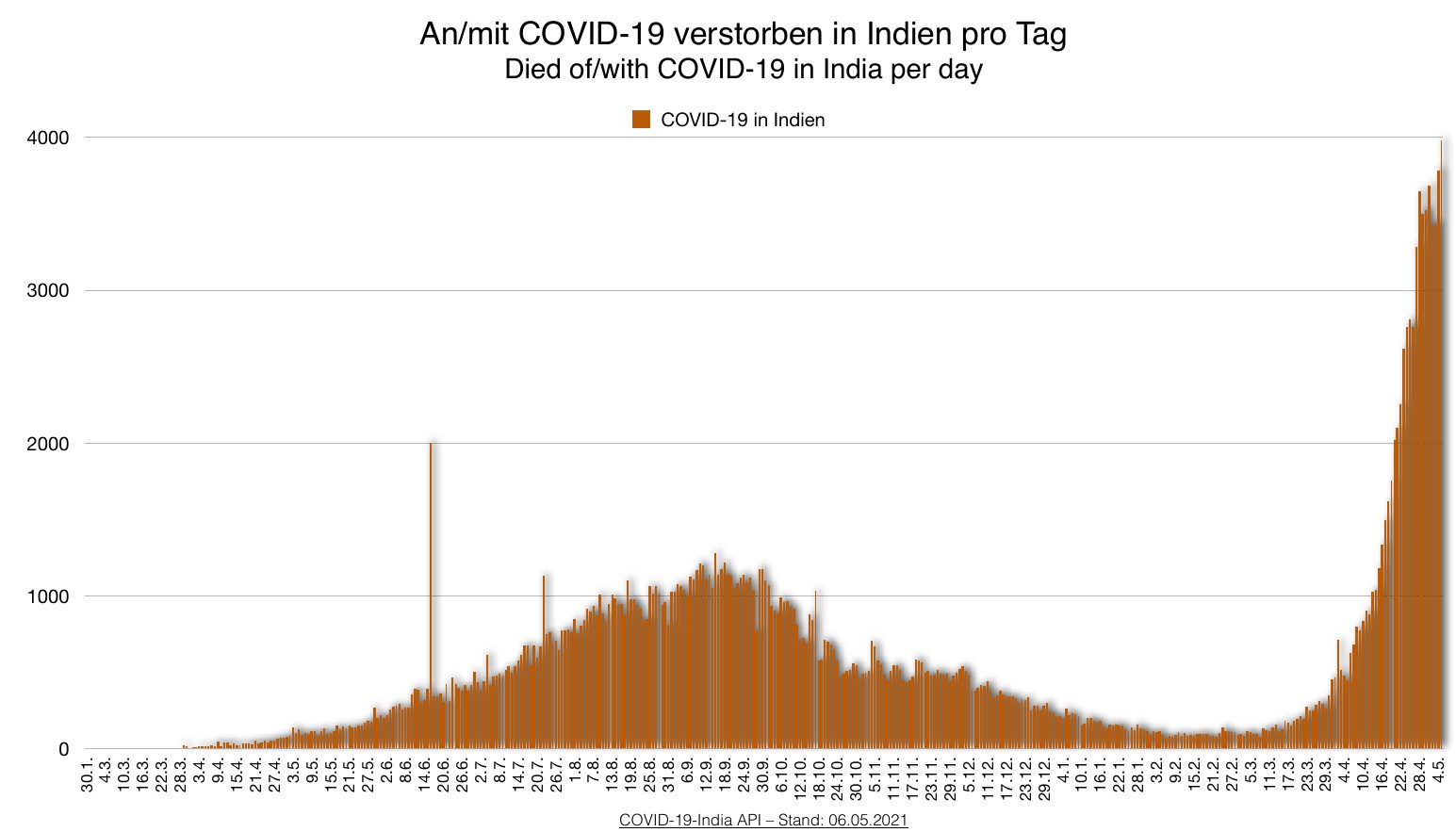
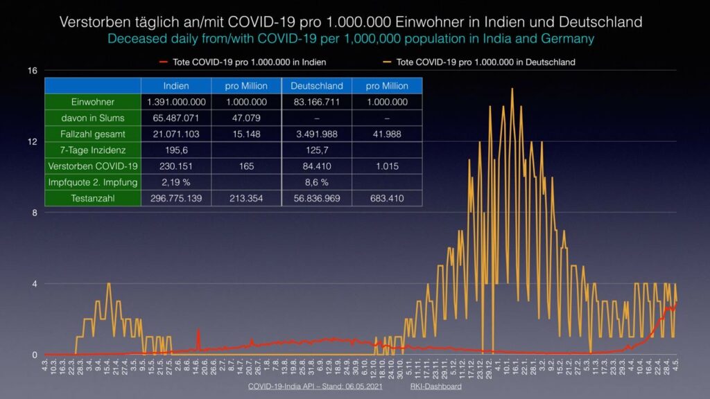
Das Problem ist: die Zahlen sind nicht ins Verhältnis gesetzt. In Indien leben ca. 1.366.000.000 Menschen. In Deutschland mit nur ca. 83.000.000 Einwohnern sterben täglich ca. 2.500 Personen. Schaut man sich den Graph der sogenannten „Coronatoten“ an, dann ist der aktuelle Peak von weniger als 4.000 Coronatoten pro Tag für ein Land mit so einer riesigen Einwohnerzahl gar nicht mehr so groß. Genau das sieht man jetzt schön farblich markiert auf der Karte. Er erwähnt zu den indischen Todeszahlen noch, dass „bisher in Indien, gemessen an der Gesamtbevölkerung, wenig Menschen an Covid-19 gestorben sind. Im weltweiten Vergleich ist die Covid-19 Sterberate in Indien wirklich gering! Aber natürlich sind das statistische Auswertungen. Es sterben auch in Indien viele Menschen an Covid-19, das darf man nicht übersehen. In den vergangenen 7 Tagen sind ca. 10% der gesamten Covid-19-Toten entstanden. Das sieht erst einmal extrem aus und wenn man das auf einer Kurve sieht, dann haut es einem den Graphen fast senkrecht nach oben. Aber in Wirklichkeit sterben in Indien gerade gemessen an der Bevölkerungszahl genauso viele Menschen wie in Deutschland oder sogar ein bisschen weniger“.
Und in der Tat. Klickt man auf seiner Karte auf Indien, sieht man die Details zu dem Land: die Sieben-Tage-Mortalität liegt bei 1,83. In Deutschland liegt sie bei 1,94. Das zeigt auch folgende, direkte Gegenüberstellung von Indien und Deutschland:
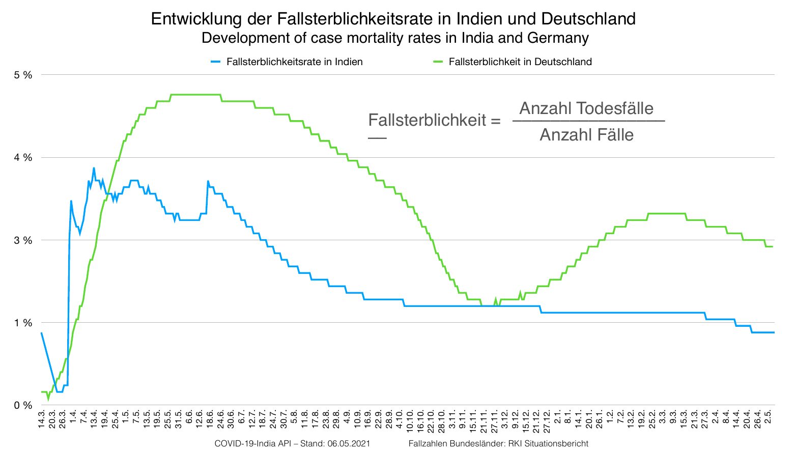
Auch bei der Fallsterblichkeit steht Deutschland schwächer da als Indien. Die Fallsterblichkeit gibt Auskunft darüber, wie viele der gemeldeten Covid-19 Fälle verstorben sind:
Aber nach über einem Jahr haben zumindest wir verstanden: Von den deutschen Quantitätsmedien, allen voran ARD und ZDF, kann man viel erwarten, aber keine objektive und sachliche Berichterstattung. Umso wichtiger sind in diesen Zeiten die neuen Medien. Auf corona-karten.com findet man zukünftig das neue „Dashboard“ mit den oben beschriebenen drei Karten.

Großartige Arbeit! Sehr gute Darstellung! Vielen Dank und weiter so! Ihr seit nicht alleine.
Ihr macht so viel Arbeit zur Aufklärung , das Gebührt meinen Dank und Respekt an Sie alle , die unermüdlichen Einsatz 💖 zeigen ‼️
Ich bin dankbar , das es noch ehrliche Menschen gibt ,die nicht aus Macht und Herrschaft ,sowie aus Geldgier handeln , sondern einfach nur ehrlich Aufklärung geben , über Risiko und Abwägen des Nutzens .
Einfach ein 💖 Danke ….es hat schon zuviel Opfer gegeben 😢😥😥
Macht weiter so, ihr seid nicht alleine , lass das Gute über das Böse siegen 🙏
Gott schütze euch alle und eure Familien 💖🙏💖
Danke Schwesterchen 🙂
Danke einmal mehr für die sachliche, kompetente und aufklärende Berichterstattung.
Ganz viel Arbeit und Recherche! Chapeau!
Lb. Gr.
Super gemacht, danke für die Arbeit und Aufklärung.